Sunday 24 November 2013

Social Grade

Here I have outlined the working class category because this is the audience that I am going to aim my music magazine at. This is because I think these are the people that would be able to relate to the magazine storylines and would be able to afford it because the magazine will advertise more local bands and storylines which people will want to read rather than reading about a band from a different country. I think that working class is usually inclusive of younger adults that may not be working yet so the magazine doesn't need to be too costly.
 

Monday 18 November 2013

Existing Double Page Spreads

http://prezi.com/39spzcvvx71n/?utm_campaign=share&utm_medium=copy&rc=ex0share


This Prezi looks at the conventional intentions of the imagery used on magazine double page spreads such as what the picture represents and how it is laid out.

Existing contents page

http://prezi.com/qajqfbyi9z_z/?utm_campaign=share&utm_medium=copy&rc=ex0share


This Prezi looks at the intentions of imagery used on the contents page and how different magazines differ from each other. This is because the pop magazine has a very spread layout with no repetitive structure where as NME usually had text down the left hand side, a mast head at the top and an image on the right.

Existing Front Covers


This post shows how different magazines use their images and how they are laid out. For example the pop magazine has everything randomly placed perhaps to resemble that it is for younger carefree teenagers, where as NME sticks to typical magazine syntax.

Monday 11 November 2013

Monday 4 November 2013

Font ideas for my music magazine

Here are some font ideas that I could use for my music magazine.I think these would be good to use because I think they fit the theme of Indie as they are quite bold and rustic rather than having boring and plain fonts. My favourite one so far is the one on the top left because it has quite a rustic feel to it and I think it would go well with the main image that I am planning to create.

Colour Scheme for music magazine

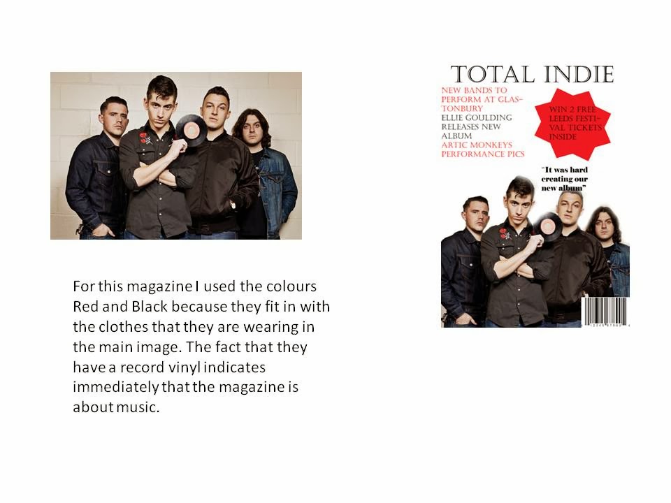
I have chosen the colours white, red and black because they are very bold colours and they go well together without being too bright. I think they will be eye catching to the audience because they are quite manly colours and the majority of people who buy indie magazines are male so it will appeal to them more.