
Tuesday, 8 April 2014
What I put in my article
Second Draft of Double Page Spread

Here I have changed the layout of the article by having it all on one side of the spread. I have also enlarged the image to highlight the fact that this article is all about Shannon. I have changed the page number to red so that it stands out on the white background more.
First Draft Double Page Spread

This is my first draft of my double page spread. There are a few points in which I want to improve such as making the image bigger because it shows that the article is all about her. I also want to make the page number red so that it stands out more.
Unused Contents Pictures


I didnt use this image because I wanted more of a live shot of the band working on their music and I feel like this is too staged.
Contents Page Second Draft

On my second draft I have changed the 'Pay just £1.99 an issue' from yellow to red so that it fits in with the colour scheme and stands out against the black background. I have also cut out the image of Izzy on the drums because it didn't look very professional as her head was cut out of the shot which is something I can improve on.
Contents Page First Draft

This is my first draft of my contents page. I am quite pleased with it however I think I need to change the yellow writing to red so that it fits in with my colour scheme. I also need to change or edit the image of Izzy with the drums because her head is cut off and it looks unprofessional.
Tuesday, 17 December 2013
First music magazine front cover draft
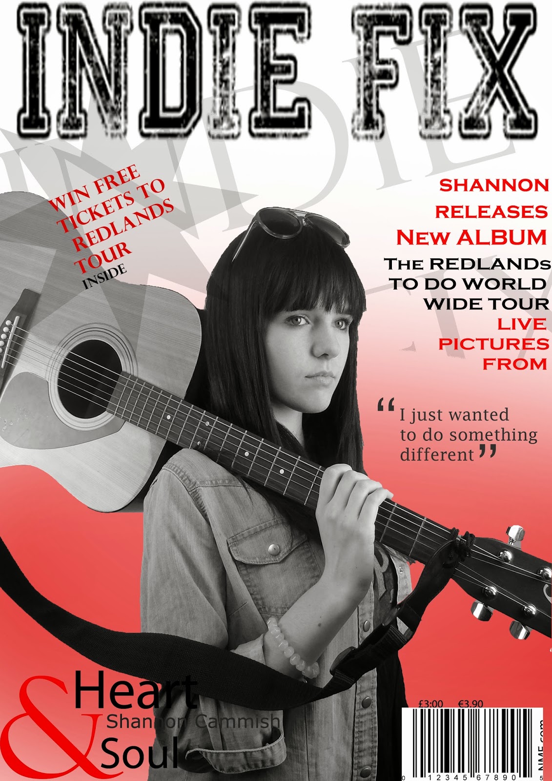
This is my first draft of my music magazine cover. I decided to use the colours red, white and black because they fit together really well however I think I need to make sure that you can still read the writing as sometimes the black text blends in with the clothes which could make it difficult for people to read. I also I also think that I need to make sure the plug is more visible as it it there to attract people to buy the magazine. I think the main image is relevant because Shannon is holding a guitar which tells the audience immediately know that it is a music magazine. Overall I think my first draft is okay, I just need to make a few improvements so that it is completely clear.
Subscribe to:
Posts (Atom)