Tuesday 17 December 2013

First music magazine front cover draft


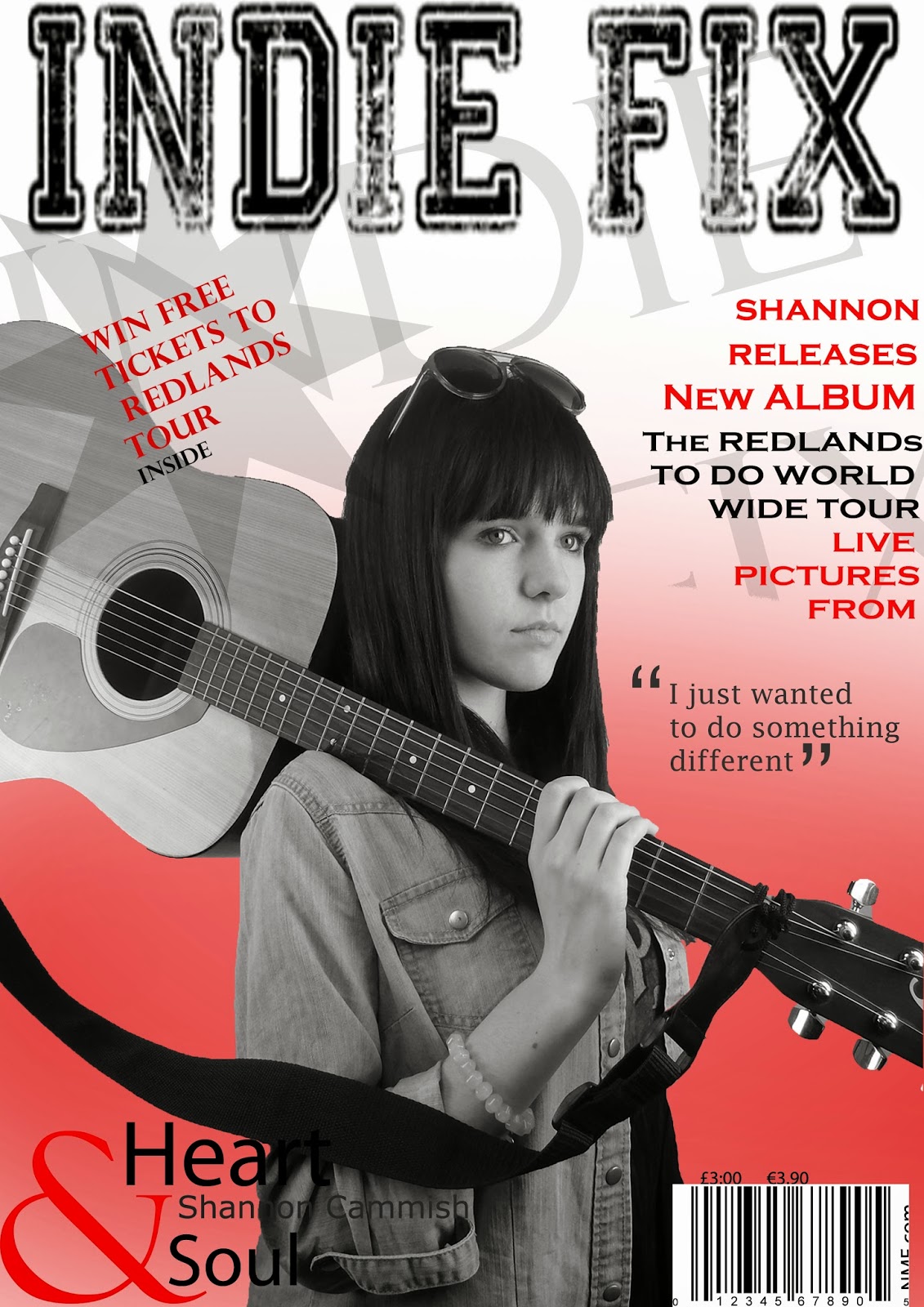
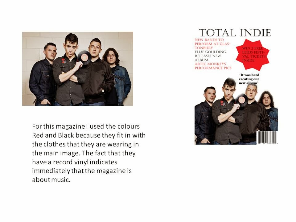
This is my first draft of my music magazine cover. I decided to use the colours red, white and black because they fit together really well however I think I need to make sure that you can still read the writing as sometimes the black text blends in with the clothes which could make it difficult for people to read. I also I also think that I need to make sure the plug is more visible as it it there to attract people to buy the magazine. I think the main image is relevant because Shannon is holding a guitar which tells the audience immediately know that it is a music magazine. Overall I think my first draft is okay, I just need to make a few improvements so that it is completely clear.

Tuesday 10 December 2013

Unused front cover photos

 I like this photo however I think that we need to be able to see the models face more because it will be easier for the reader to recognise who the artist is.
 I like this photo however I feel like it doesn't link with my genre very well because there is nothing to tell the reader that it is a music magazine.
I dont like this image because it isn't that relative to  music magazine.
 I like this magazine because I feel like it fits the ideology of an Indie magazine because of the guitar and glasses. Also the denim jacket is quite Indie which again reminds the reader of the magazine genre.
 I dont think this photo is very good because it doesn't leave much room for text around the outside.
 I like this photo because it looks like the model is writing a song however I think I would use this on the double page spread rather than the front cover.
I think this image is okay however the lighting is quite dark and you cant see her face that well.

Monday 9 December 2013

Photoshop -- Enhancing the eyes


In this video I learnt how to make the eyes look brighter which will help when editing my magazine because it will make it look more professional.

Watching YouTube Videos


I have watched a few tutorials for photoshop on youtube so that I have more knowledge on how to use it. I have learnt a lot of new skills such as how to use the magic wand which will make it easier when editing a photo from its background. I will use this technique on my magazine cover because I will want to put my image onto a better background. This tutorial was particularly beneficial because it taught me how to put writing behind or in front of the image and how to put the magazine faintly in the background which I think will look really good.

Monday 2 December 2013


This is the outfit i want my artits to wear in my main image.

Mock Ups of Front Cover, Contents Page and Double Page Spread


Here are my mock ups for my music magazine. I think they are practical because I have included space for images, text and mastheads however I think I need to find some space to add more images.

Sunday 24 November 2013

Social Grade

Here I have outlined the working class category because this is the audience that I am going to aim my music magazine at. This is because I think these are the people that would be able to relate to the magazine storylines and would be able to afford it because the magazine will advertise more local bands and storylines which people will want to read rather than reading about a band from a different country. I think that working class is usually inclusive of younger adults that may not be working yet so the magazine doesn't need to be too costly.
 

Monday 18 November 2013

Existing Double Page Spreads

http://prezi.com/39spzcvvx71n/?utm_campaign=share&utm_medium=copy&rc=ex0share


This Prezi looks at the conventional intentions of the imagery used on magazine double page spreads such as what the picture represents and how it is laid out.

Existing contents page

http://prezi.com/qajqfbyi9z_z/?utm_campaign=share&utm_medium=copy&rc=ex0share


This Prezi looks at the intentions of imagery used on the contents page and how different magazines differ from each other. This is because the pop magazine has a very spread layout with no repetitive structure where as NME usually had text down the left hand side, a mast head at the top and an image on the right.

Existing Front Covers


This post shows how different magazines use their images and how they are laid out. For example the pop magazine has everything randomly placed perhaps to resemble that it is for younger carefree teenagers, where as NME sticks to typical magazine syntax.

Monday 11 November 2013

Monday 4 November 2013

Font ideas for my music magazine

Here are some font ideas that I could use for my music magazine.I think these would be good to use because I think they fit the theme of Indie as they are quite bold and rustic rather than having boring and plain fonts. My favourite one so far is the one on the top left because it has quite a rustic feel to it and I think it would go well with the main image that I am planning to create.

Colour Scheme for music magazine

I have chosen the colours white, red and black because they are very bold colours and they go well together without being too bright. I think they will be eye catching to the audience because they are quite manly colours and the majority of people who buy indie magazines are male so it will appeal to them more.

Tuesday 29 October 2013

More outfit ideas


I have put another outfit together which shows more of the music indie fashion. I think the person modelling for the front cover should have a guitar because it will let the reader know exactly what the magazine is about. I also went for skinny jeans because they are very fashionable and many band members and indie artists wear them. 


Ideas for costume I may use for front cover


I have put an outfit together which I think is a modern image of Indie fashion which consists of a beanie and penny board which is quite casual and comfy which reflects the layers back persona of Indor music. 

Reader Profile Research

http://prezi.com/ifgpqgk2bbwq/?utm_campaign=share&utm_medium=copy